 Latest images
New forum logo/banner
5 posters
Page 1 of 1
![]()
 New forum logo/banner
![]() Tobold Thu Mar 10, 2011 11:46 am
Tobold Thu Mar 10, 2011 11:46 am
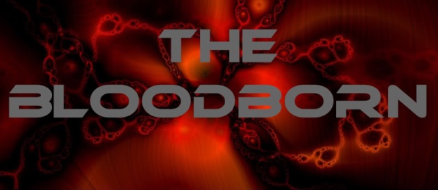
https://i.imgur.com/AxQGh.jpg - banner
https://i.imgur.com/GclEK.jpg - logo with background
let me know what you think :>
https://i.imgur.com/GclEK.jpg - logo with background
let me know what you think :>
Tobold- Posts : 4
Join date : 2011-03-10
![]()
![]()
Re: New forum logo/banner
![]() Soot Thu Mar 10, 2011 11:59 am
Soot Thu Mar 10, 2011 11:59 am
Lovely! Less futuristic than the current one which is a plus, in my opinion. Could perhaps use less black border? I don't know. Good work!
Soot- Posts : 4
Join date : 2011-03-10
![]()
![]()
Re: New forum logo/banner
![]() Linyui Thu Mar 10, 2011 5:51 pm
Linyui Thu Mar 10, 2011 5:51 pm
It looks good, but I have to agree with Soot. I think it'll look better with a bit smaller outline/border.Soot wrote:Could perhaps use less black border?
Linyui- Posts : 4
Join date : 2011-03-10
![]()
![]()
Re: New forum logo/banner
![]() Ian Sun Mar 13, 2011 9:36 am
Ian Sun Mar 13, 2011 9:36 am
Looks noice! A smaller outline would make it look better though imo.
The background is really great though
The background is really great though

Ian- Posts : 28
Join date : 2011-02-08
Age : 35
Location : Oxfordshire -

![]()
![]()
Re: New forum logo/banner
![]() Ciane Sun Mar 13, 2011 2:39 pm
Ciane Sun Mar 13, 2011 2:39 pm
Reduce stroke width. It looks annoying to have really big black lines...
Ciane- Posts : 7
Join date : 2011-03-08
![]()
![]()
Re: New forum logo/banner
![]() Soot Mon Mar 14, 2011 5:04 am
Soot Mon Mar 14, 2011 5:04 am
Still in awe from your work, Tobold. Any news on when/if the new logo will be up on the forums?
Soot- Posts : 4
Join date : 2011-03-10
![]()
![]()
![]()


Page 1 of 1
Permissions in this forum:
You cannot reply to topics in this forum|
|
|